
In the age of experiences, graphic design has become a strategic tool that transforms spaces into distinctive brand environments. The wallpapers I have designed for international hotels combine storytelling, brand identity and environmental graphics to enrich the guest experience and strengthen each property’s visual character.
Rather than simply decorating walls, each design forms part of a cohesive visual system that integrates with the architecture and interior design, guiding the visitor experience and creating emotional connections with the brand.
The projects presented here demonstrate how graphic design can turn physical environments into memorable brand experiences, adding value not only to hospitality but also to offices, retail and other commercial spaces.
The city’s DNA as a brand driver
This series of projects for the hospitality sector stems from a shared strategic challenge: how can a contemporary and disruptive design brand integrate organically into cities with such a strong historical and cultural identity? The solution was Visual Transcreation, a process in which the hotel’s modernity acts as the canvas and the city’s local heritage (Granada, Milan, Frankfurt) provides the narrative and character.
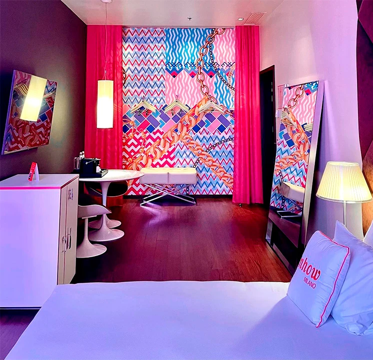
NHOW MILANO
The Pulse of Design and Fashion
The challenge was to compete in the world’s fashion capital with a creative proposal sophisticated enough for Milan while staying true to Nhow disruptive brand spirit.
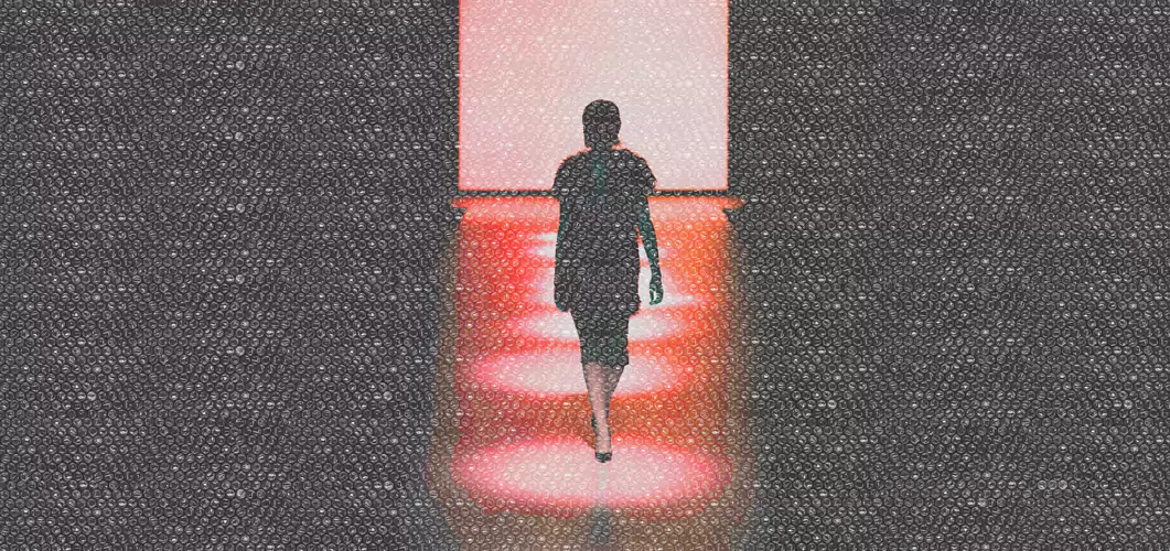
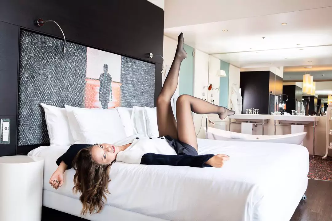
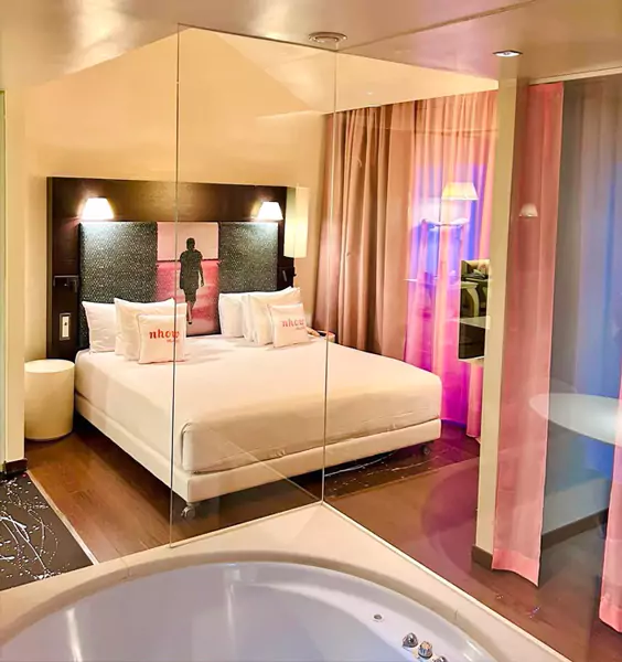
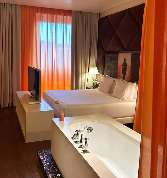
The design incorporates a visual language inspired by industrial elegance and Italian avant-garde aesthetics. Bubble-wrap textures create the illusion of a translucent layer floating over the graphics, transforming the space into an environment that feels like an extension of both the runway and the design studio.
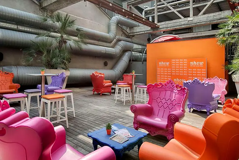
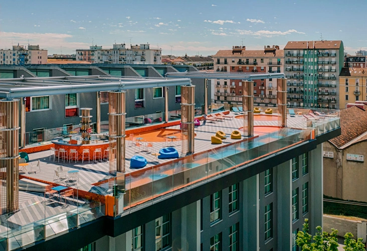
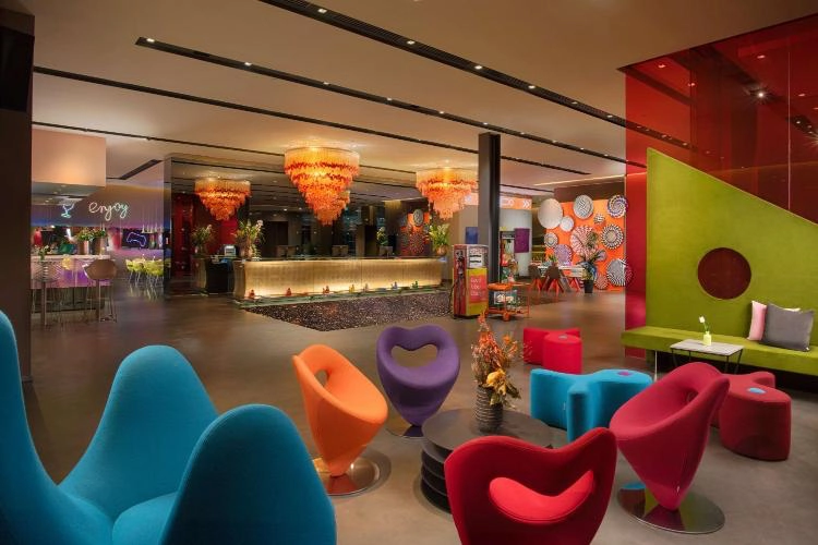
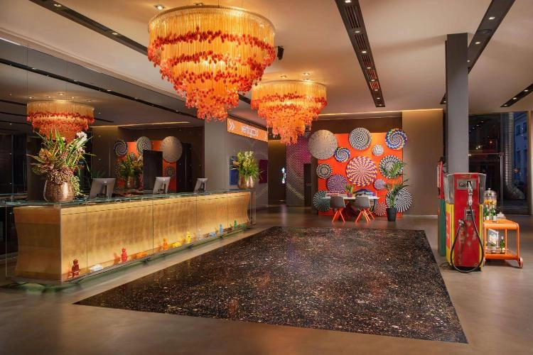
Enigmatic model
This piece portrays the silhouette of a runway model mid‑stride, wrapped in shadow and mystery. The figure evokes an introspective atmosphere, inviting viewers to interpret the scene through their own perspective.
The surface finish, precisely replicating the texture of bubble wrap, creates a tension between elegance and materiality — contrasting the sophistication of fashion with the everyday nature of its medium.
The result is a work that blends subtlety, irony, and visual sensuality.
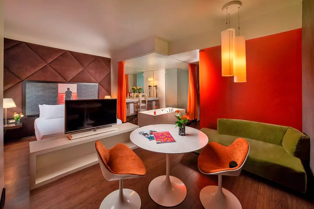
The visual codes of Italian fashion
THE CHALLENGE
To compete in the world capital of design with a concept that embodies Milan’s sophistication whilst adding the irreverent spirit of the nhow brand.
LA SOLUCIÓN
The implementation of a visual language inspired by the iconoclastic elegance of Italian fashion and its patterns. The ‘Bold’ style – almost brutalist – combined with Pop Art aesthetics, creates a visual identity that balances strength, sophistication and visual impact.
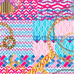
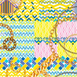
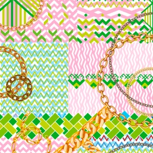
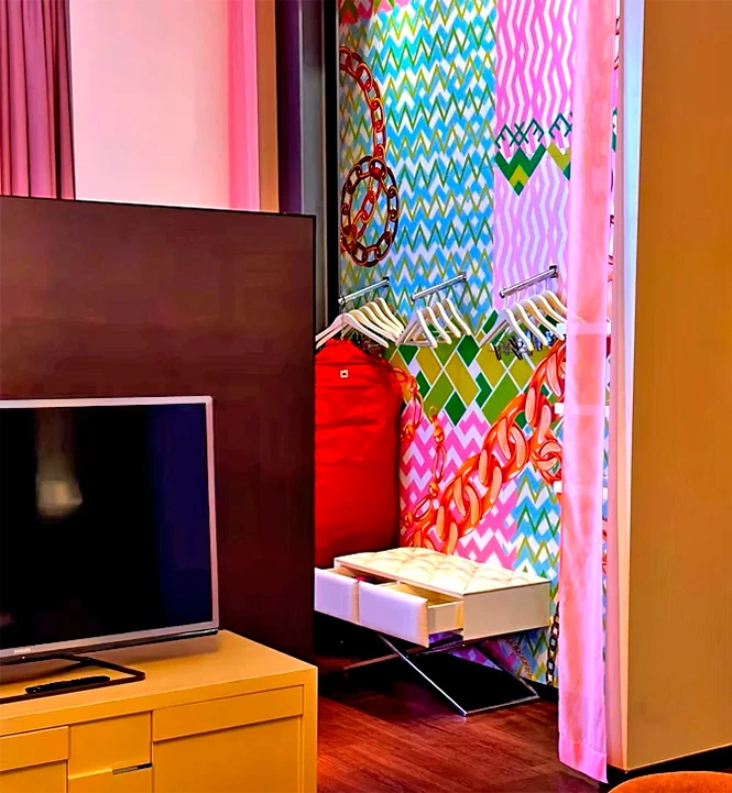
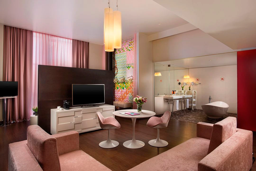
PATTERNS USED AS A VISUAL IDENTITY
PRINTED AND INSTALLED IN VARIOUS LOCATIONS
NHOW BRUSSELS BLOOM
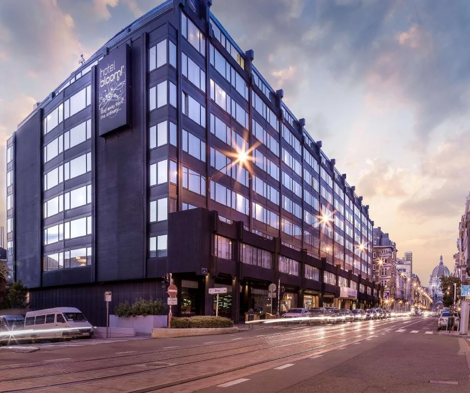
The Architecture of Colour
THE CHALLENGE
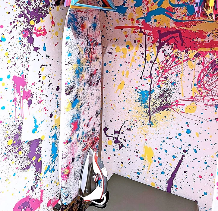
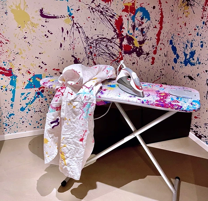
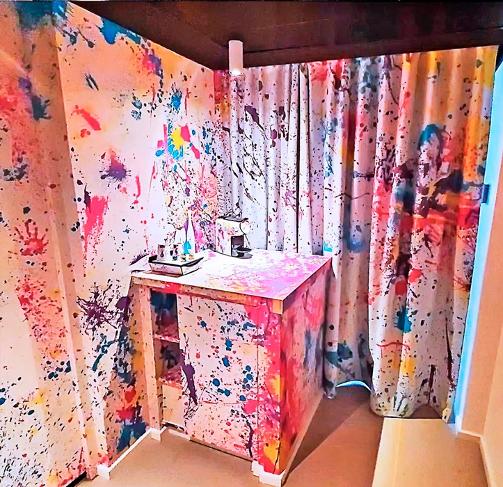
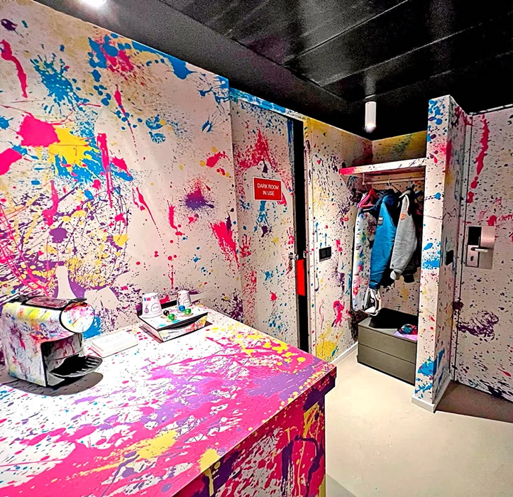
To infuse the concept of an ‘artist’s studio’ into the hotel’s 305 rooms and suites, creating an atmosphere of creative chaos that is, at the same time, a coherent and professional brand experience.
LA SOLUCIÓN
A visual narrative based on the deconstruction of visual communication. Using the primary colour palette (cyan, magenta, yellow) alongside nhow’s signature purple, I designed a system of environmental graphics that emulate “blots” and dynamic strokes. This Visual Ecosystem transforms every room into an immersive studio where colour is not merely decorative, but acts as the thread running through the guest experience, balancing expressive energy with the discipline of corporate identity.
PATTERNS USED AS A VISUAL IDENTITY
PRINTED AND INSTALLED IN VARIOUS LOCATIONS
NHOW ROMA
A modernised Heritage identity
THE CHALLENGE
Capturing the essence of the ‘Eternal City’ without resorting to tourist clichés, transforming its identity through nhow’s disruptive spirit.
THE STRATEGY
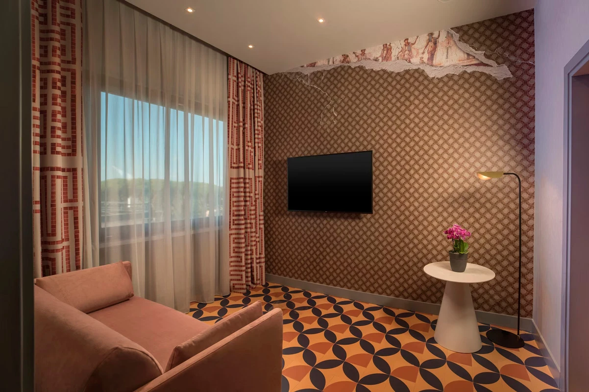
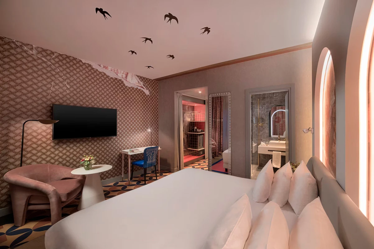
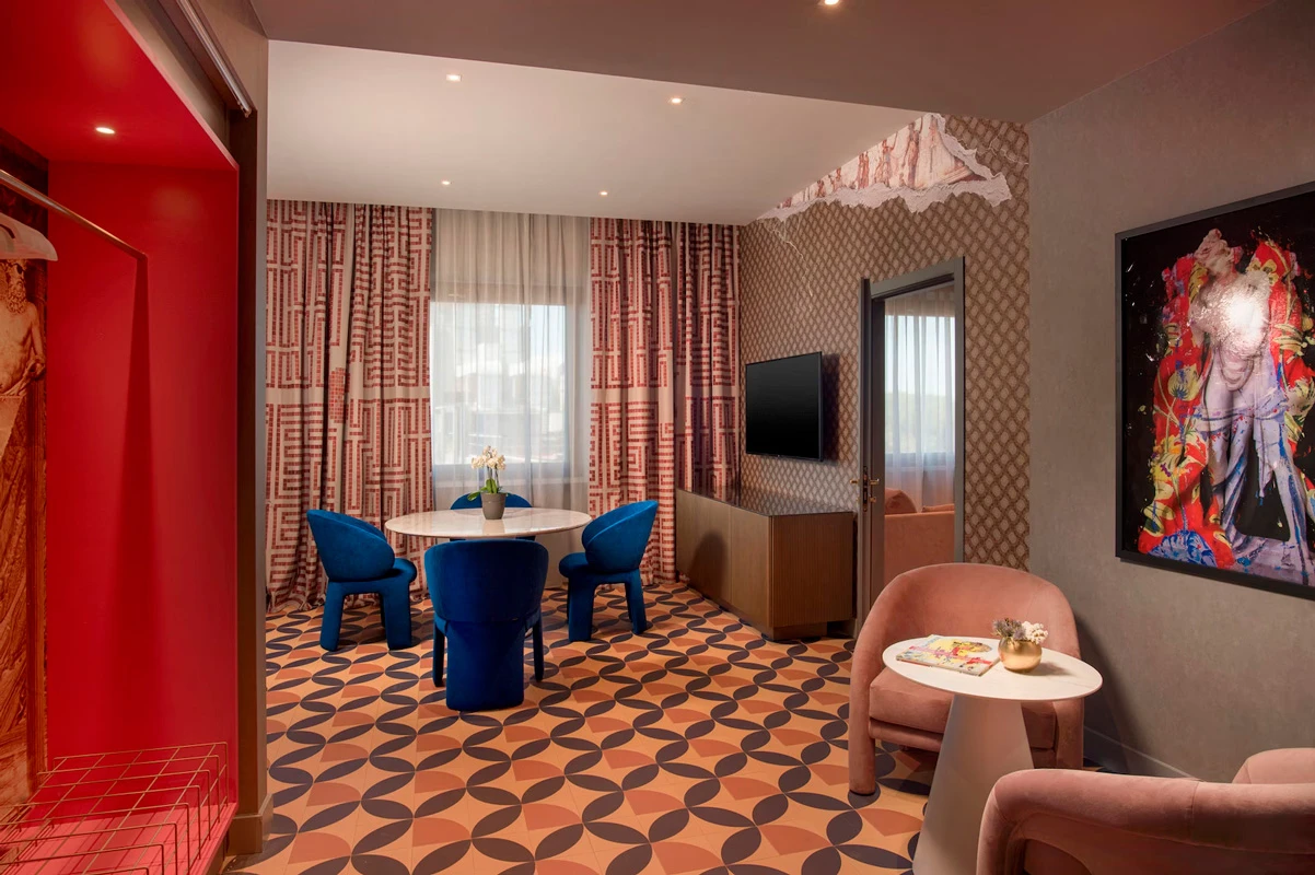
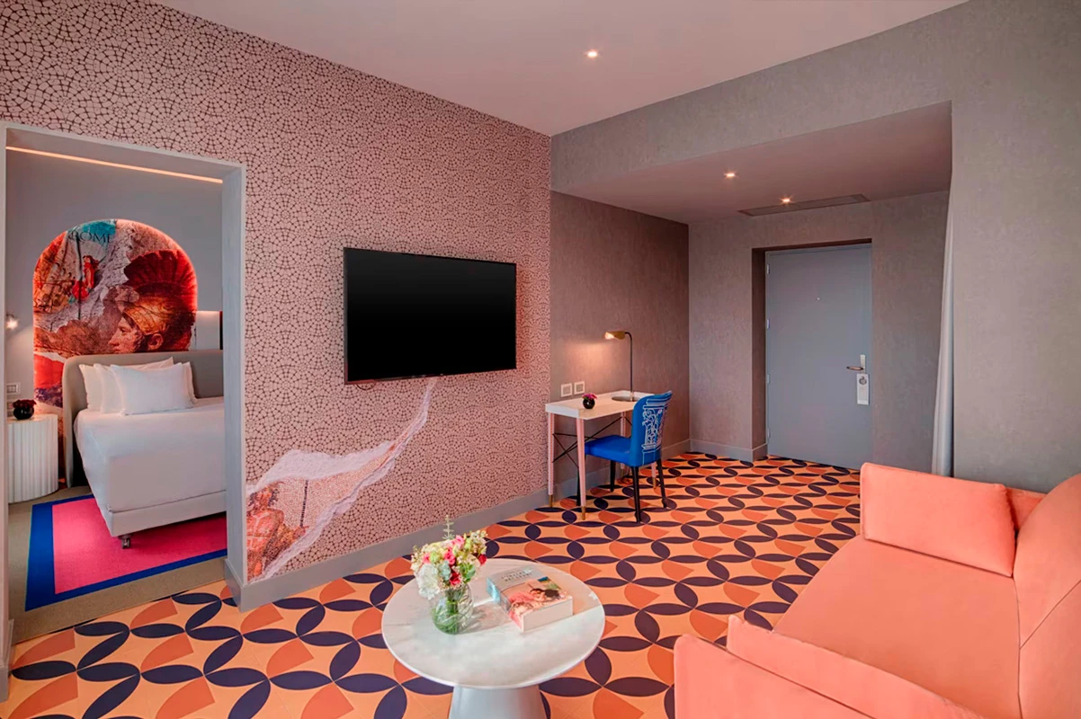
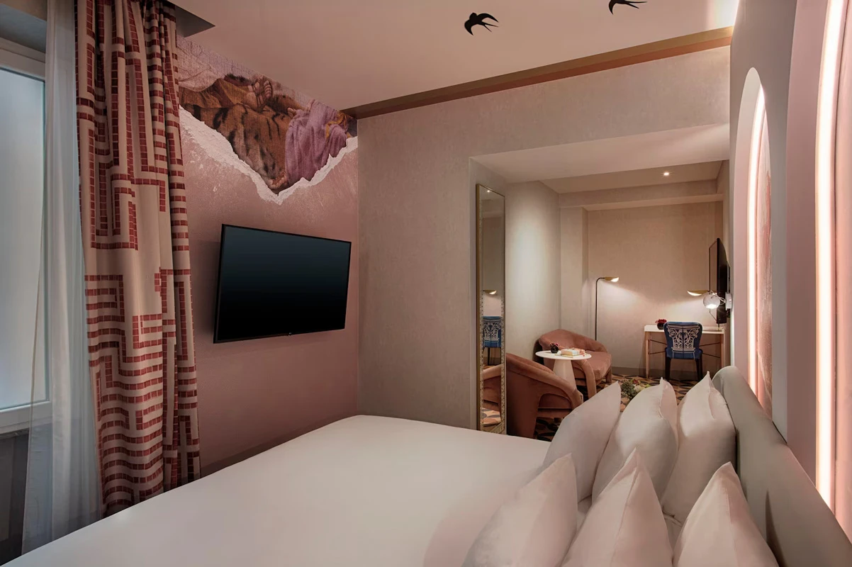
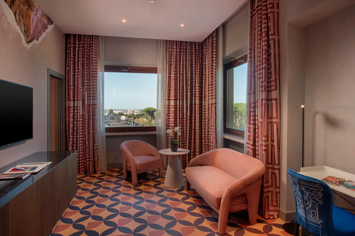
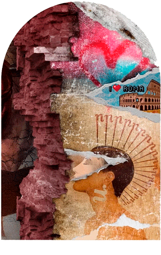
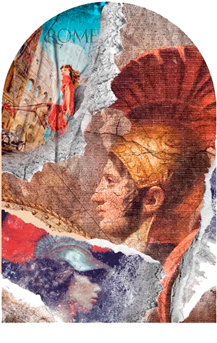
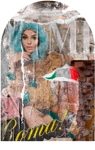
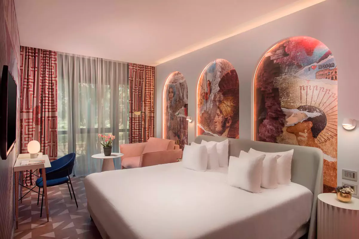
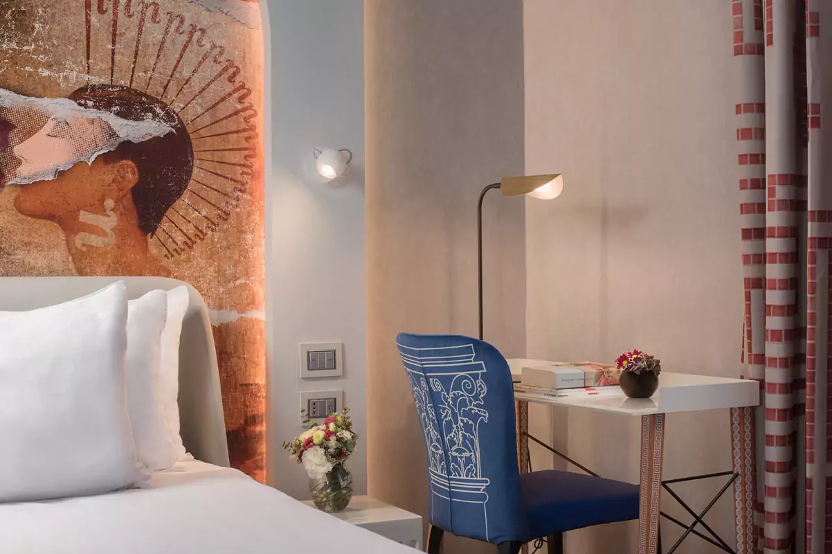
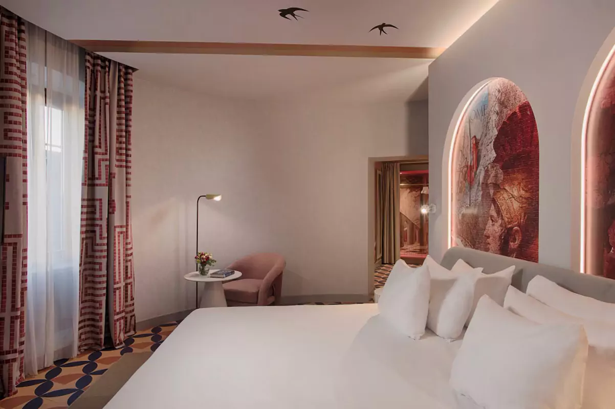
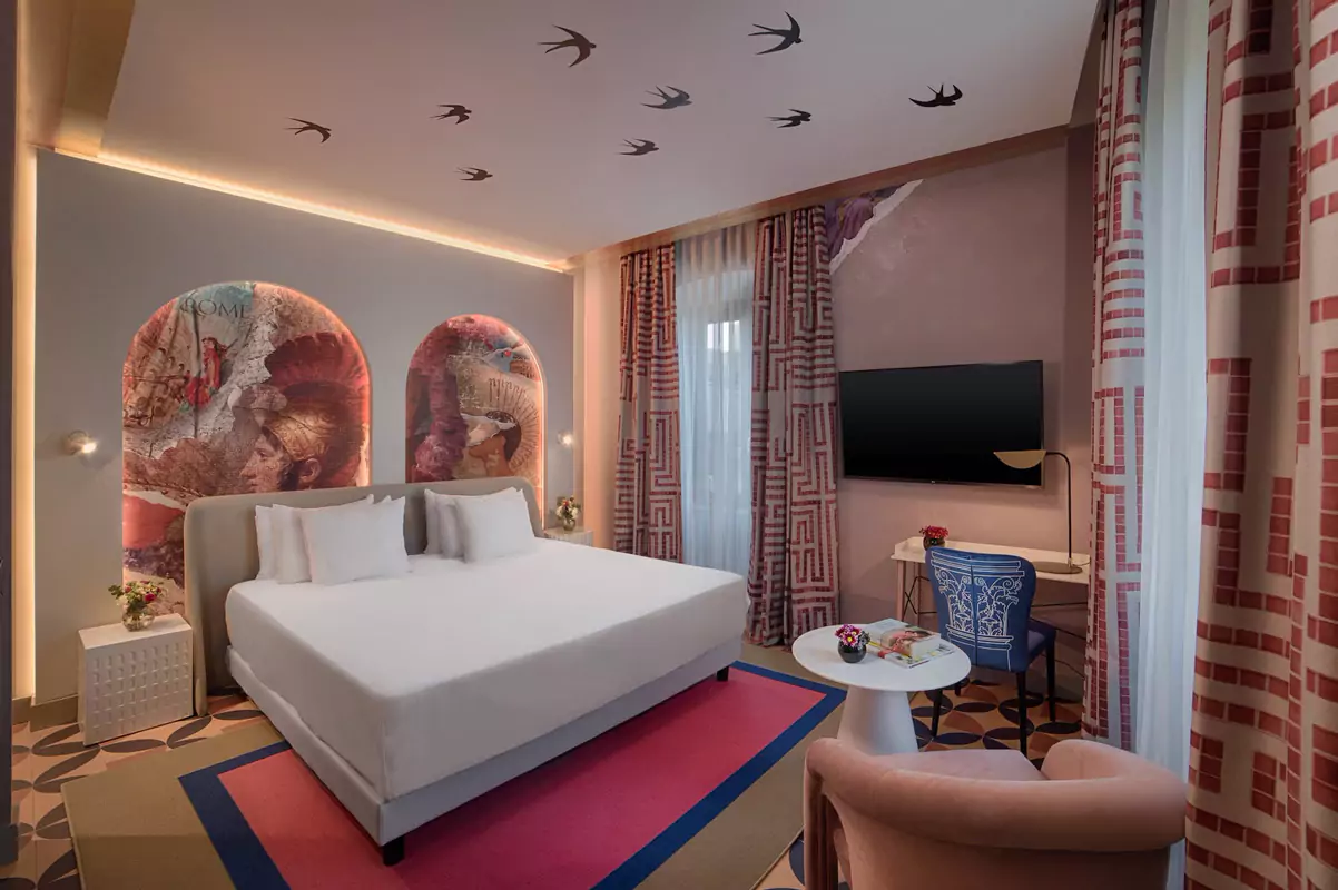
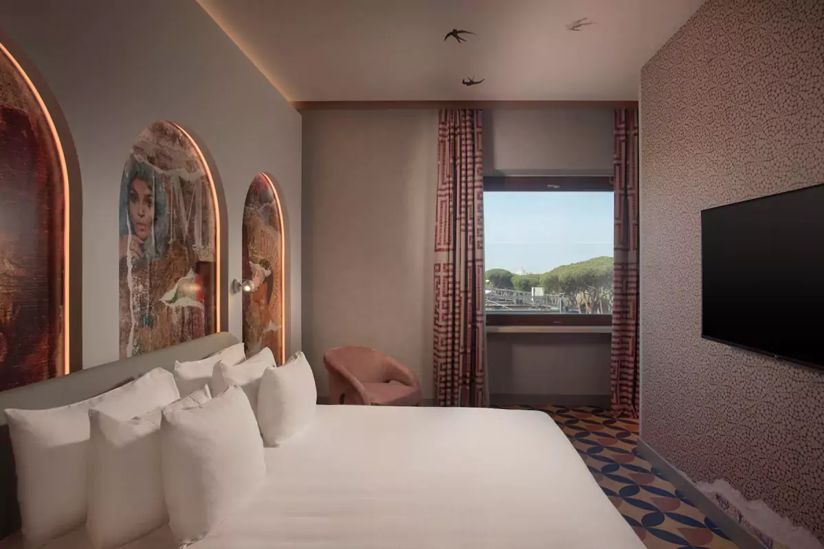
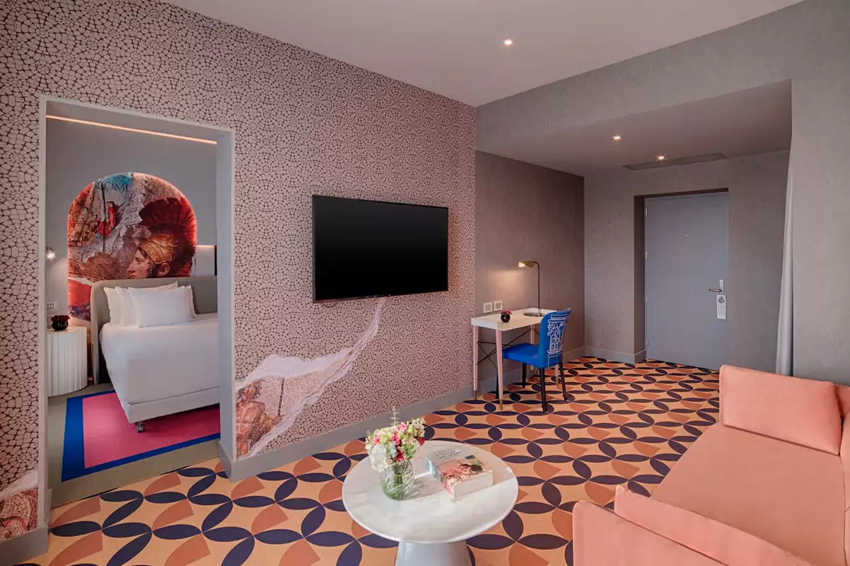
Under the concept ‘Layers of History’, I developed an integrated narrative ecosystem spanning 260 luxury suites and spaces. The experiential and strategic visual storytelling, designed to transform the guest experience, connects the identity of the city of Rome and the different periods of its history with the DNA of the Nhow brand.
PRINTED DESIGN IN CONTEXT
Immersive visual systems
THE CHALLENGE
Capturing the essence of the ‘Eternal City’ without resorting to clichés, blending its classical heritage with nhow’s industrial avant-garde.
THE STRATEGY
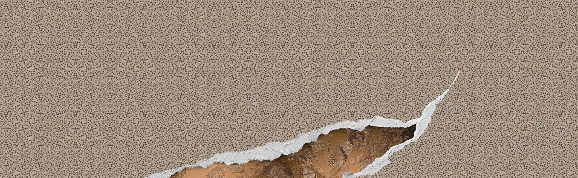
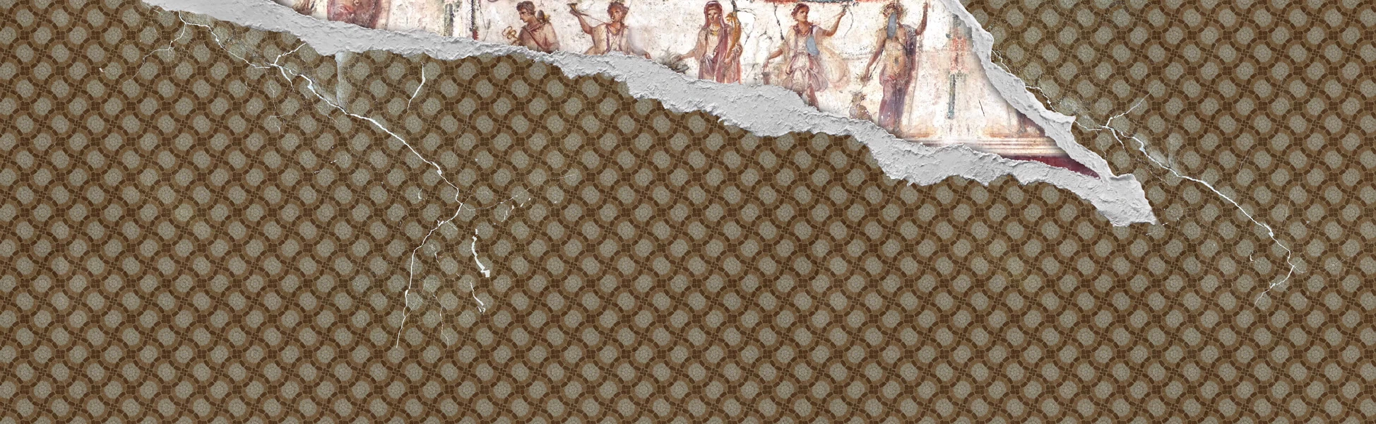
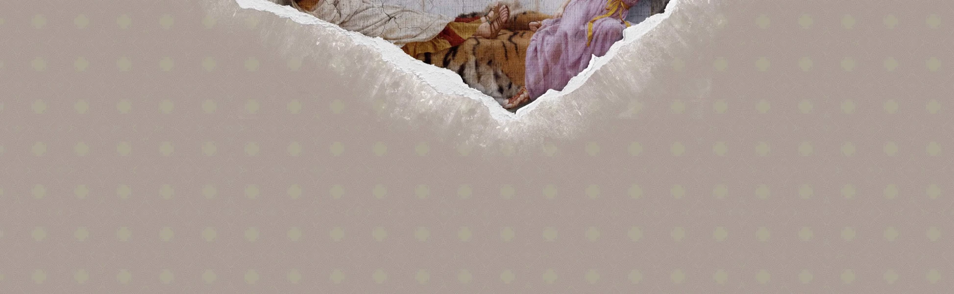
I developed a visual narrative based on graphic archaeology. I designed three sets of Experiential Visual Systems (Wallpapers) that play with the superimposition of layers. Through deliberate ‘graphic breaks’, the design simulates torn layers that reveal fragments of ancient Roman art hidden behind repetitive classical patterns. This approach creates a dynamic dialogue between history and contemporary design, inviting a process of constant discovery.
PRINTED DESIGNS IN CONTEXT